
Deisgn for simplicity, discoverability, clarity and scalability
CASE STUDY #1
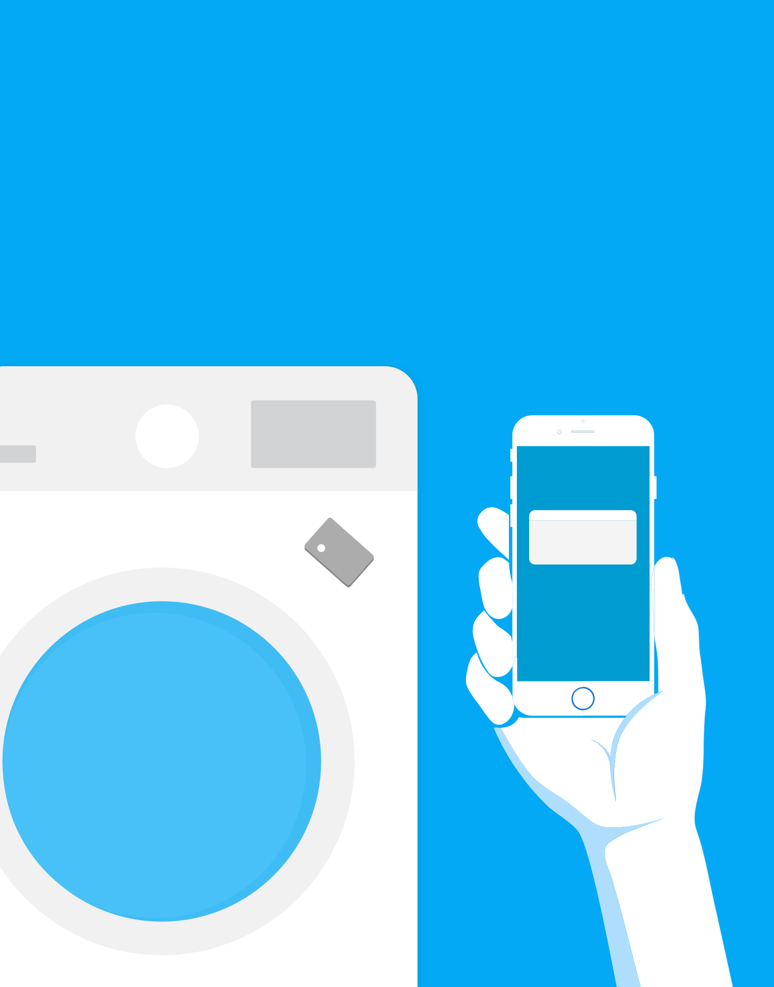
OKX Pay
About OKX Pay
OKX Pay is a built-in crypto payment solution in the OKX app, enabling easy, secure transfers via QR codes, contacts, and links. It supports self-custody, global transfers, and auto-yield—making crypto payments as simple as texting.
Role
As one of the two lead designers, I created the design of the core flows including add funds, on-chain send, and convert
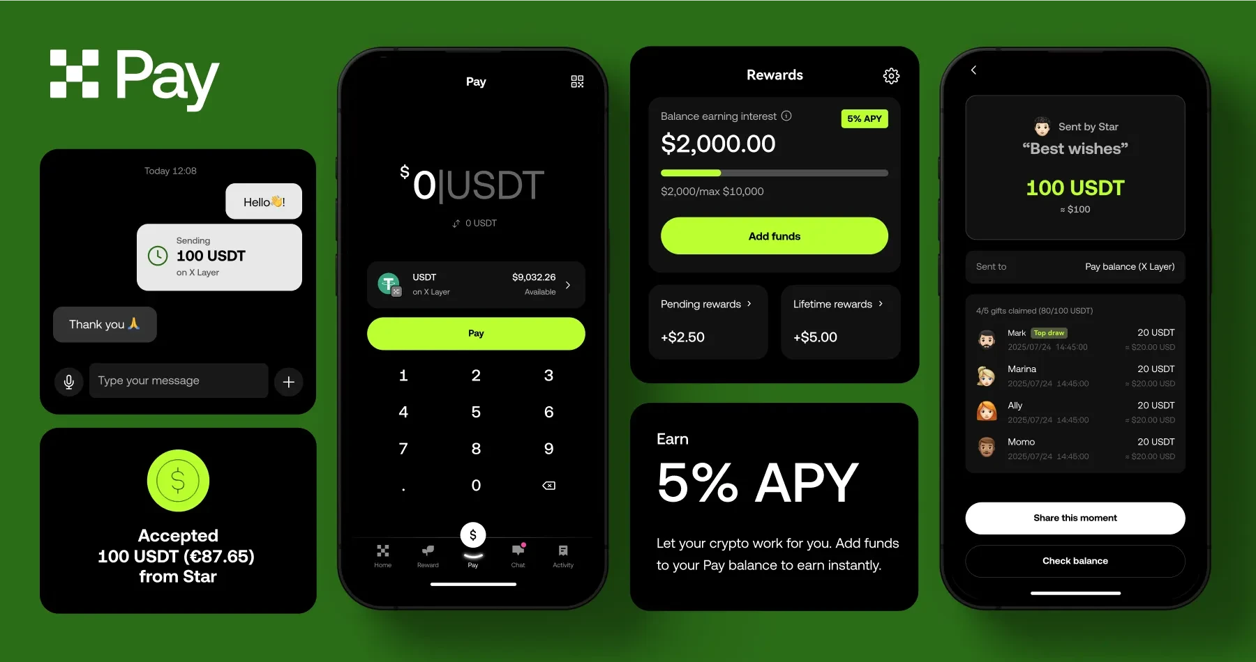
CORE FEATURE
Convert to supported crypto
Challenge
If users receive tokens that are unsupported by Pay, they need a seamless way to convert them into supported tokens.
Solution
Develop a simple conversion process that allows users to easily exchange unsupported tokens for those supported by Pay.

CORE FEATURE
One-click cross-network send flow
Challenge
When users attempt to send a token through a specific network but only have tokens from other networks, they will have to leave the flow to manually convert and restart the process.
Solution
Implement one-click conversion, allowing users to easily convert tokens from other networks and complete the transaction within the same flow.

CORE FEATURE
Add funds via onchain receive
Challenge
Users will be required to pay an activation fee when sending a token through a specific network for the first time. We don't want to surprise users with unexpected costs.
Solution
Provide upfront notification when users receive a token through the network, informing them about the activation fee prior to initiating the transaction.

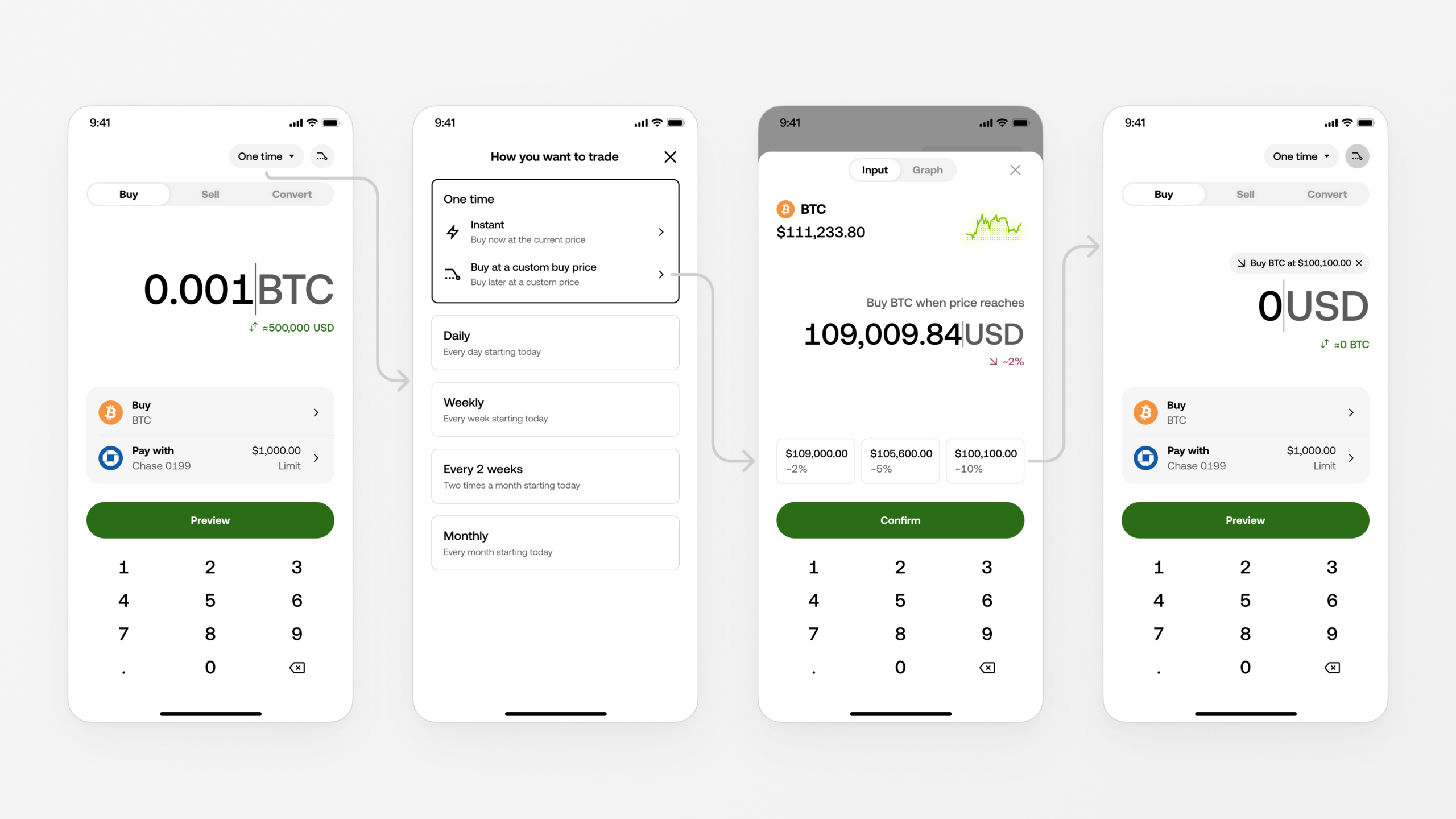
CASE STUDY #2
Simple trading - Recurring buy
About recurring buy
We created a feature that allows users to automatically purchase crypto at regular intervals
Role
As the lead designer, I created all the design including the core buy flow and recurring buy management.

DESIGN EXPLORATION
Translating business goals to action items


Turn limitations to opportunity
Due to technical constraints, the amount input and payment sections are fixed and cannot be modified. Combined with limited screen space, this limits our ability to add recurring purchase options.

DESIGN EXPLORATION
Recurring buy screen
We considered adding ‘Recurring Buy’ under ‘One-Time Buy,’ but due to its distinct order type and the inapplicability of ‘Sell’ and ‘Convert’ features, we opted to create a separate experience.

RECURRING BUY SCREEN
A simple and usable experience

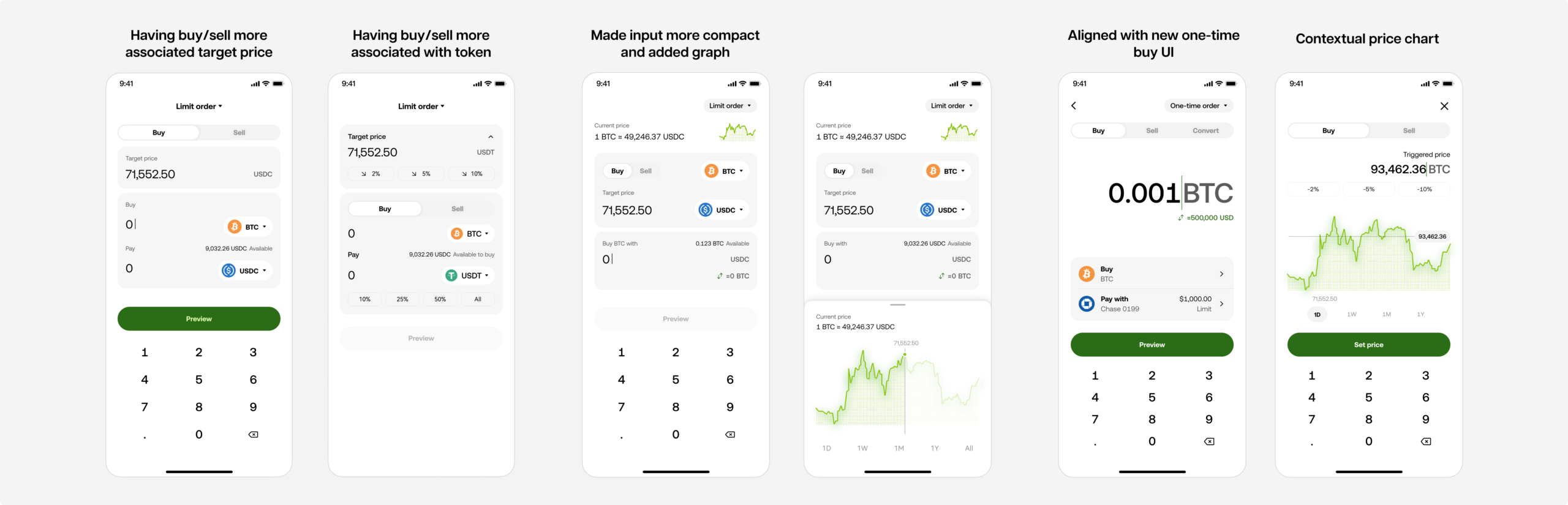
DESIGN EXPLORATION
Recurring buy plan overview/management
The main questions that came to mind were:
- On which product layers should we surface the entry point?
- Should we provide different information at different layers?

PLAN DETAILS
Empowering recurring investments with data-driven insights
- Positive performance framing
- Clear future projection from long-term perspective
- Behavior reinforcement
CROSS-TEAM COLLABORATION
Collaborating across teams to optimize entry points
After identifying potential entry screens, I collaborated with designers and PMs from asset and portfolio teams to align on optimal placement, ensuring a cohesive user experience.

DESIGN DELIVERY
Designing for process clarity
Clarity is a crucial design element. It's essential to inform users about:
- The stages of the process
- The actions occurring at each stage
- The status of each stage after the order is placed
This ensures a transparent and intuitive experience for the user.

CASE STUDY #3
A quick, natural and contextual apporach of setting up limit orders
DESIGN EXPLORATION
Core flow - Set up limit price and order size
To understand user intent, I combine quick interviews with AI-assisted research to uncover junior traders’ mindsets and explore interaction opportunities.
KEY TAKEAWAYS
Ensuring design consistency through rigorous QA
For this project, we went through a rigorous design QA process to ensure all use cases across regions were addressed. This thorough approach not only helped us meet the highest design standards but also guaranteed a seamless and consistent experience for our users.
Selected Works

PlayStationWeb Design

Next TruckingWeb Design

Walmart GSWeb Design

MerlinWeb Design
QC-xDesigned digital experience to reduce manual labor

FlipCross-platform messaging experience
RumbleMoble App + IoT Device
aarontang.design@gmail.com